
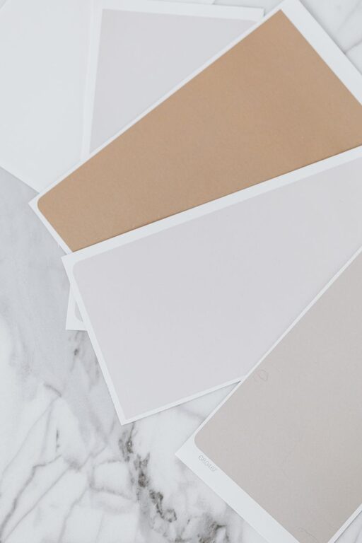
Creating a calm and peaceful environment at home often starts with the colors you choose for your walls and decor. Calm colors can help reduce stress, promote relaxation, and make your living space feel more welcoming. Whether you want to refresh a single room or redesign your entire home, selecting the right calm colors involves more than just picking your favorite shade. In this guide, we’ll walk you through practical tips to help you choose colors that bring tranquility and harmony to your living spaces.
Why Choose Calm Colors?
Calm colors tend to be soft, muted, and easy on the eyes. They can influence mood and energy levels, making them ideal for spaces like bedrooms, living rooms, and reading nooks where you want to unwind. These colors often include shades of blue, green, soft grays, and warm neutrals. The right choices can create a serene backdrop for your daily life.
Understand the Psychology of Color
Before you dive into color swatches, it helps to understand the general effects different colors have:
– Blue: Often associated with calmness and stability, blue promotes relaxation and focus.
– Green: Reminiscent of nature, green is refreshing and soothing.
– Gray: A neutral gray creates a peaceful, modern look without overpowering other elements.
– Beige and Cream: Warm neutrals provide coziness and comfort.
– Lavender and Soft Purple: These offer gentle calm and a touch of subtle luxury.
Keep in mind that the way a color looks can vary depending on lighting and surrounding decor, so consider these factors when making your choice.
Tips for Choosing Calm Colors
1. Consider Natural Light
Natural light can dramatically change how colors look in your space. Rooms with plenty of sunlight might appear brighter, so cooler shades like soft blues or greens will feel refreshing. In rooms with limited natural light, warmer tones like beige or muted yellows can add warmth without feeling overwhelming.
2. Test Samples on Your Walls
Always test color samples on your walls before committing. Paint small sections and observe them at different times of day to see how the light affects the hue. This simple step can help avoid surprises once the entire room is painted.
3. Use a Color Palette
Instead of focusing on a single color, consider a palette of calm tones that complement each other. For example, pair soft blue walls with light gray furniture and cream accents. Using a palette helps create a balanced, cohesive look throughout the room.
4. Choose Matte or Satin Finishes
Finish matters as much as color. Matte or satin paint finishes tend to absorb light instead of reflecting it, which can contribute to a calm, subtle atmosphere. Glossy paints might feel too bright or busy for spaces meant to relax.
5. Balance Warm and Cool Tones
Too much of either warm or cool tones might make a room feel off balance. Mixing warm neutrals with cool blues or greens can create a harmonious atmosphere that feels inviting and calm.
6. Consider the Mood of Each Room
Think about how you use each room. Bedrooms benefit from soft, restful colors, while living rooms can handle slightly more vibrant but still calming hues. Kitchens and bathrooms may benefit from fresh, clean colors like soft greens or pale blues.
7. Use Color to Highlight Features
Instead of painting all walls the same color, use calm colors to highlight architectural features such as molding or built-in shelves. This approach adds dimension without overwhelming the space.
Additional Ideas to Enhance Calmness
Incorporate Natural Elements
Pair your calm color scheme with natural materials like wood, stone, or plants. These textures complement soothing colors and deepen the feeling of tranquility.
Limit Bold Patterns
While patterns can be fun, overly bold prints might clash with calm colors. Opt for subtle, small-scale patterns or solid colors to keep the ambiance peaceful.
Layer with Soft Textures
Add throw pillows, rugs, and curtains in complementary calm tones and soft fabrics to make the room cozier.
Common Calm Color Mistakes to Avoid
– Choosing colors that are too dark, which can make a room feel heavy or gloomy.
– Picking colors that clash with existing furnishings or flooring.
– Ignoring the undertones of a color, which can make it appear different than expected once painted.
– Skipping the sample testing stage and committing without seeing the colors in the room’s lighting.
Final Thoughts
Selecting calm colors for your home is a rewarding process that can transform your living space into a sanctuary. By understanding color psychology, testing samples, and balancing your palette, you can create a soothing environment that supports relaxation and well-being. Remember to factor in lighting, room purpose, and your personal preferences to find the perfect calm colors that make your home feel just right.
Start small, experiment with samples, and enjoy the process of creating a peaceful retreat right in your own home.